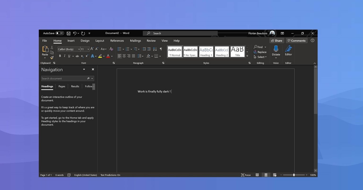
Microsoft is testing the new dark theme in Microsoft Word
Microsoft started to bring dark theme support for its own applications last year. In fact, the main appearance of the Microsoft Office series components currently supports a dark theme.
It’s just that the main interface of components such as Microsoft Word is still light-colored because this software involves content input and display, which is somewhat difficult.
Components such as Microsoft Outlook already support dark colors in both the appearance and the main interface, and Microsoft is now bringing similar effects to Word.
Microsoft has now pushed the Microsoft Word with a redesigned dark UI to beta users, that is, the background of the content page changes from the original white background to a dark background.
When entering text in this piece of content, it will automatically become white otherwise it will be unclear. Of course, if it needs to be printed, it will actually have a white background and dark text.
This style looks more comfortable, mainly because the surroundings in the current stable version are dark and the text content is white. Too much contrast makes the effect worse.
At present, this new style has been pushed to Office Insider users, and Microsoft will push it to Microsoft Office 2016-2019 and 365 versions.
Via: windowslatest


