Microsoft developed a floating taskbar for Windows 10
In the previous article, we mentioned that Microsoft is carrying out a major upgrade to the Windows 10 UI through the Sun Valley project to revitalize the best desktop experience of the Windows system.
This includes not only the application and software interface upgrades but also the rounded corner design of the Start Menu and floating taskbar.
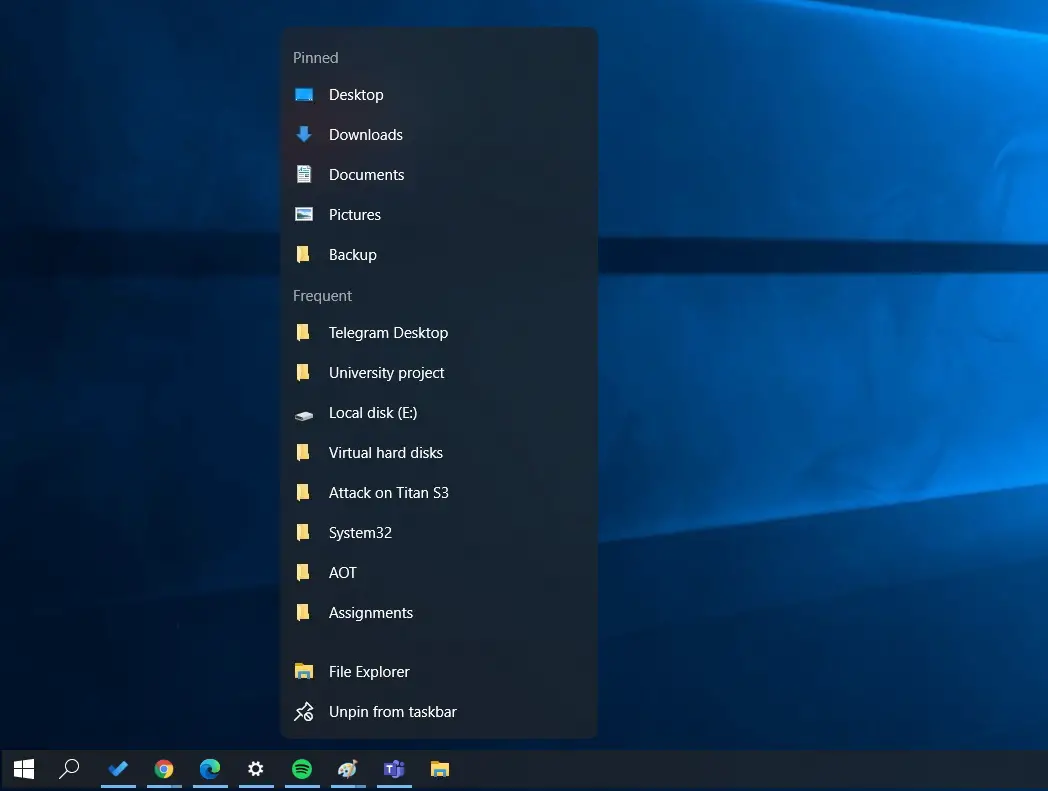
The media also designed a preview of the floating taskbar on Windows 10 based on the current known news. From the preview, we can see that this is very similar to the floating start menu.
When we right-clicked the taskbar icon, the pop-up menu also began to float, that is, there is a very obvious space gap between it and the taskbar.
This is also the reason Microsoft uses to express the floating menu. After the interval, it is like the start menu and the taskbar menu floating on the desktop, which has a light experience. Of course, as shown in the figure, the taskbar has also begun to use rounded corners.
These changes have not yet been launched, and Microsoft will launch them through the Windows 10 Dev version in the follow-up period.
Via: windowslatest


