The new logo of Notepad++ releases
Notepad++’s Twitter account posted a message about the new Notepad++ logo. Compared to the old version of the Logo, the overall logo has not changed much, but the Notepad said that the new version of the logo is more attractive, more concise and more meaningful than the old version.
The new logo of Notepad++ is much more pleasant, meaningful and elegant. pic.twitter.com/hbYGjRKhlz
— Notepad++ (@Notepad_plus) October 13, 2019
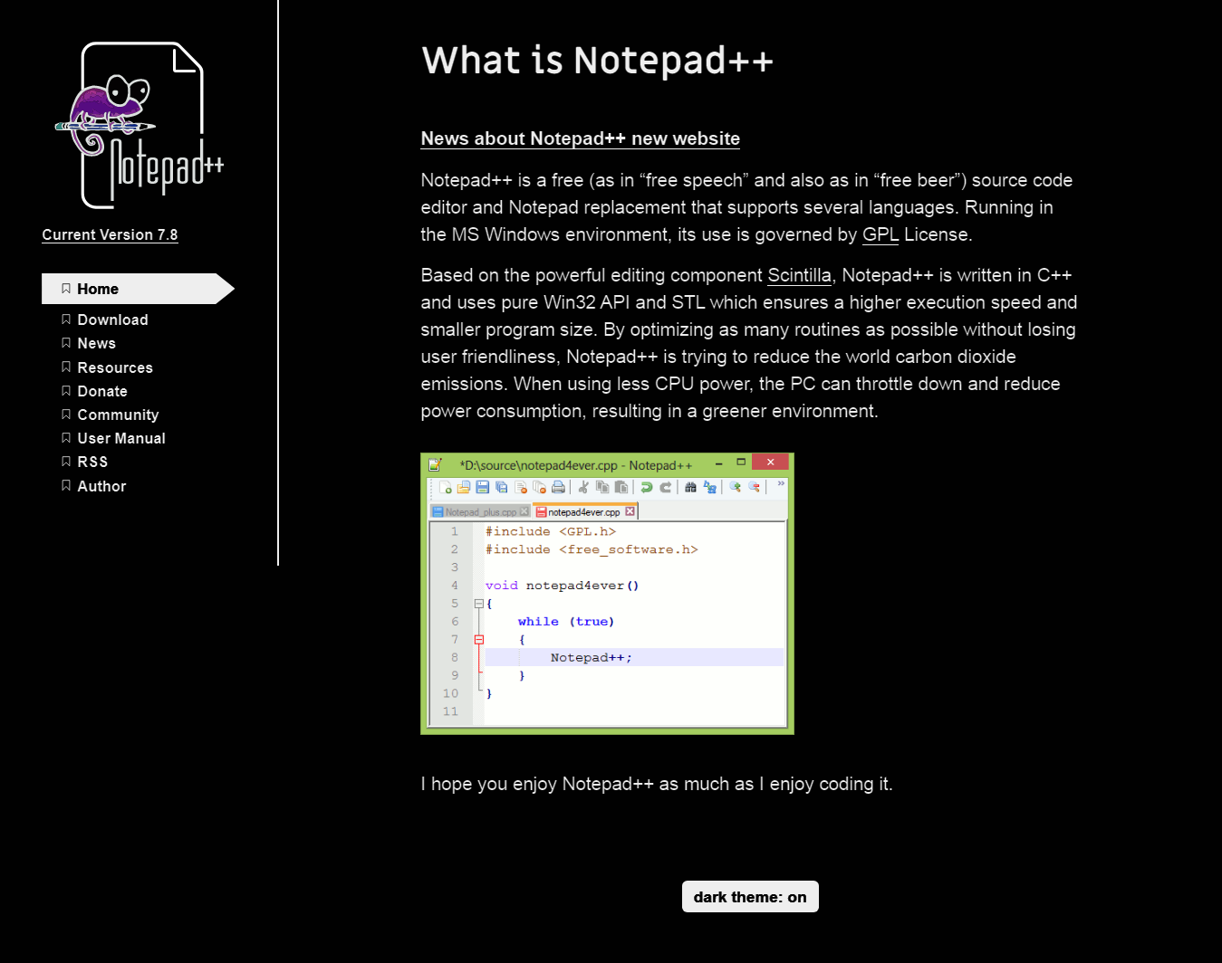
In addition to using the new logo, we also found that its official website has also been completely redesigned and adopted a popular adaptive responsive design. Notepad++ authors say that since July 2011, the look of the site has remained unchanged for 8 years, and it’s time to change and adopt new web design.

Finally, the new version of the official website has also added a dark mode.


