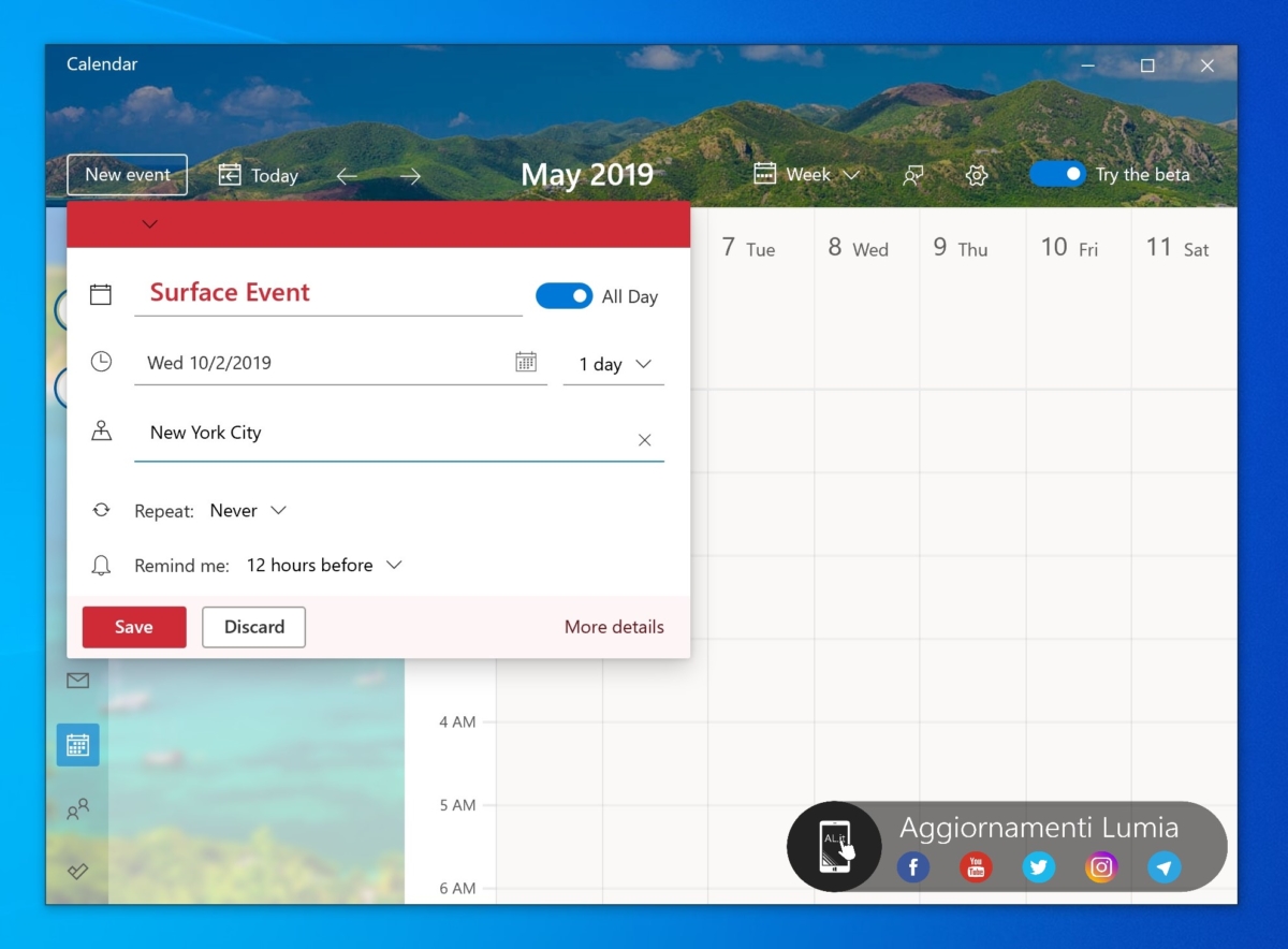
Windows 10 calendar application with new interface leaked
The Italian technology blog Aggiornamentilumia recently released a set of screenshots showing the new user interface of the calendar app on the Windows 10 platform, which looks very beautiful. The overall design is somewhat similar to the recently released Microso To Do. By default, the calendar uses a landscape layout theme, with various wallpapers that the user likes at the top, and calendar options on the left side, where users can customize events and tasks in the timeline on the right.

In addition, the report said that Microsoft is creating some new themes for the Calendar application. Other improvements include a hamburger menu incorporating the Fluent Design design language and an improved setup menu. Microsoft also made adjustments to the event creation menu, which now appears as a pop-up instead of the previous full screen.

It is not yet clear when Microsoft will publish a new version of the calendar app to consumers, but AggiornamentiLumia reports it is part of the “test plan.” The screenshot also shows the “Try to Beta” switch, so this is limited to Windows Insider users at this stage.


