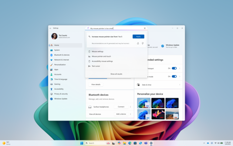
In the promotional video that Microsoft showed at the Windows 11 conference, new Settings applications appeared briefly, but Microsoft did not mention improvements in this app at the conference.
The Settings application in the leaked image file is still Windows 10 style, but with the release of the Windows 11 preview version, the new Settings app version has finally arrived.
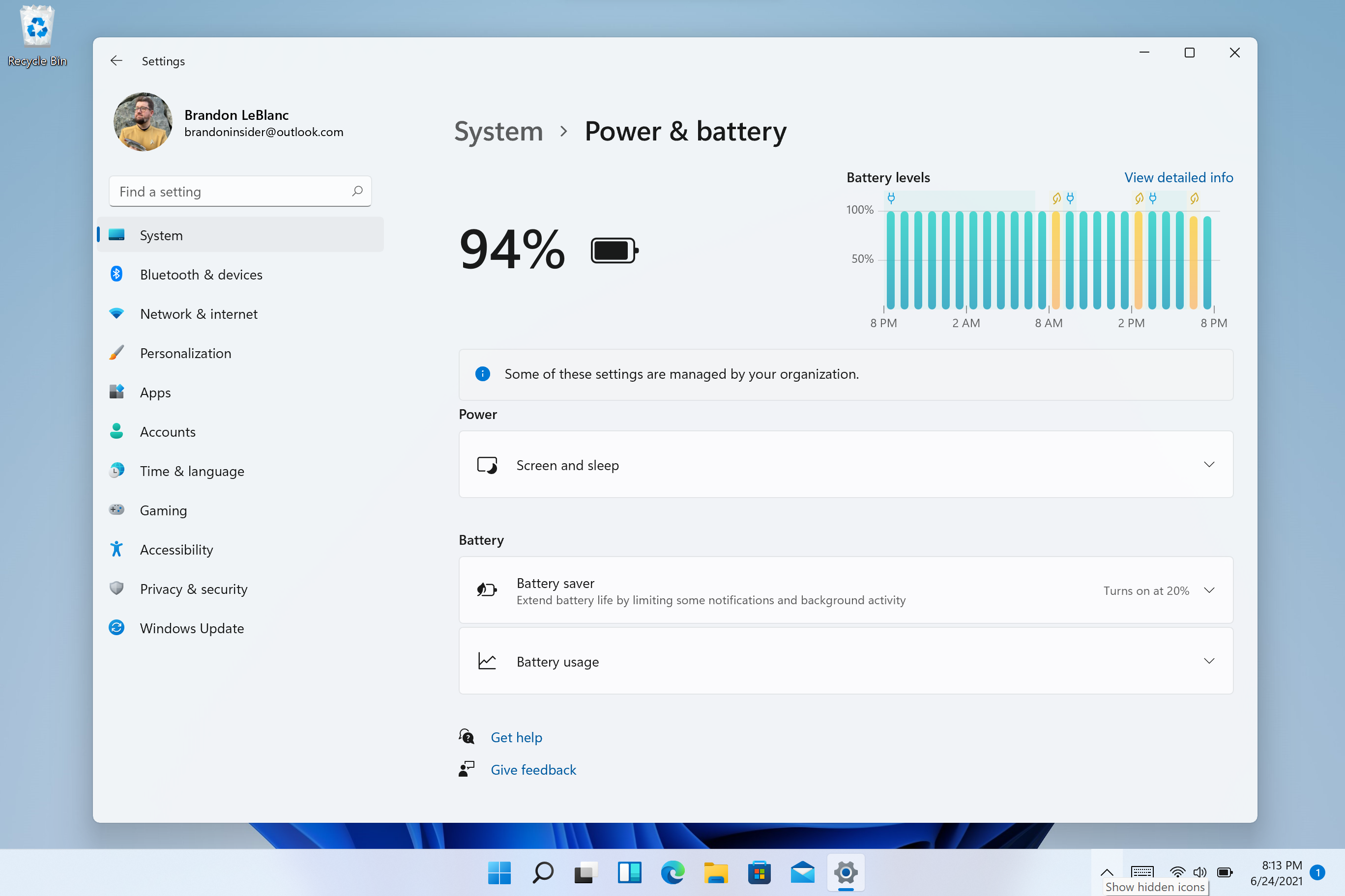
The new Settings application adopts a cascading design and adds more images for a mashup. The most important thing is that all the main options are listed on the left for users to quickly click.
Each sub-option uses the style to open a new page, while the pop-up page used in the old version of the settings application, this improvement is also fresh.

Microsoft writes:
We designed Settings to be beautiful, easy to use and inclusive of all your Microsoft experiences in Windows 11. Settings has left-handed navigation that persists between pages, and we have added breadcrumbs as you navigate deeper into Settings to help you know where you are and not lose your place. Settings pages are also all new, with new hero controls at the top that highlight key information and frequently used settings for you to adjust as you need. These new hero controls span across several category pages like System, Bluetooth & devices, Network & Internet, Personalization, Accounts, and Windows Update. We also have added expandable boxes for pages with a lot of settings.


